
I designed an app with a clean and intuitive interface that allows users to track and manage their subscriptions. This was a personal project in response to my own struggles with keeping up with the large amount of subscriptions I was paying for.
Recently, I set out to develop my drawing skills, and in a fit of unbridled determination, I bought multiple subscriptions to online courses through Udemy and Skillshare. These courses ended up not being the right fit for me and as time went on I stopped logging onto these courses.
Fast forward 2 months, I get billed for these subscriptions and I realize I was paying for products that I didn't even know I was paying for! 😱
I felt a lack of agency and control knowing that I wasn’t able to stay on top of the subscriptions that I was shelling out $$ for.
And so, I decided I needed to create an app to manage and track subscriptions with the goal to give back agency and control to the modern consumer.
The user base of these apps would be mainly people immersed in the SaaS economy, purchasing a variety of subscriptions, which bill on a monthly or annual basis.
One persona would be a hobbyist video editor who purchases and uses SaaS and digital services like Netflix from a personal account.
From my research I was able to narrow my focus onto some key touch points in the user journey:
The user had expectations to:

The basic flow of the app was mapped out with a flowchart. The green nodes represent screens and the white nodes represent actions.
Creating a user flow allowed me to see the relationships between the screens and actions that the user will experience while completing their goal.
.png)
Before making any concrete plans on the design of the app, I interviewed a potential target user to gain a better understanding of the problem at hand. While I only had time to conduct one interview before moving on to the design process, I would prefer to conduct at least 5 to get sufficient information.
The interviewee showed pain points during the process of managing online transactions. They expressed that they felt powerless and defeated when failing to keep track of payment dates and overall expenses.

Their existing methods of coping with this problem were keeping mental notes, and writing down reminders on a paper calendar. They were unsatisfied with existing solutions and were eager to hear an app could help them better manage these payments.
One thing that stood out to me was the variety of online payments that the interviewee made on a regular basis. Initially, I had only anticipated that the app would be used for subscriptions to SaaS products. However, the interviewee also encountered issues when managing payments for things like their mortgage or a CAA membership.
I revised my plans after hearing from my interviewee, to include more manual logging capabilities for the user. I wanted the user to feel that they could go to the app to manage all of their online payments.
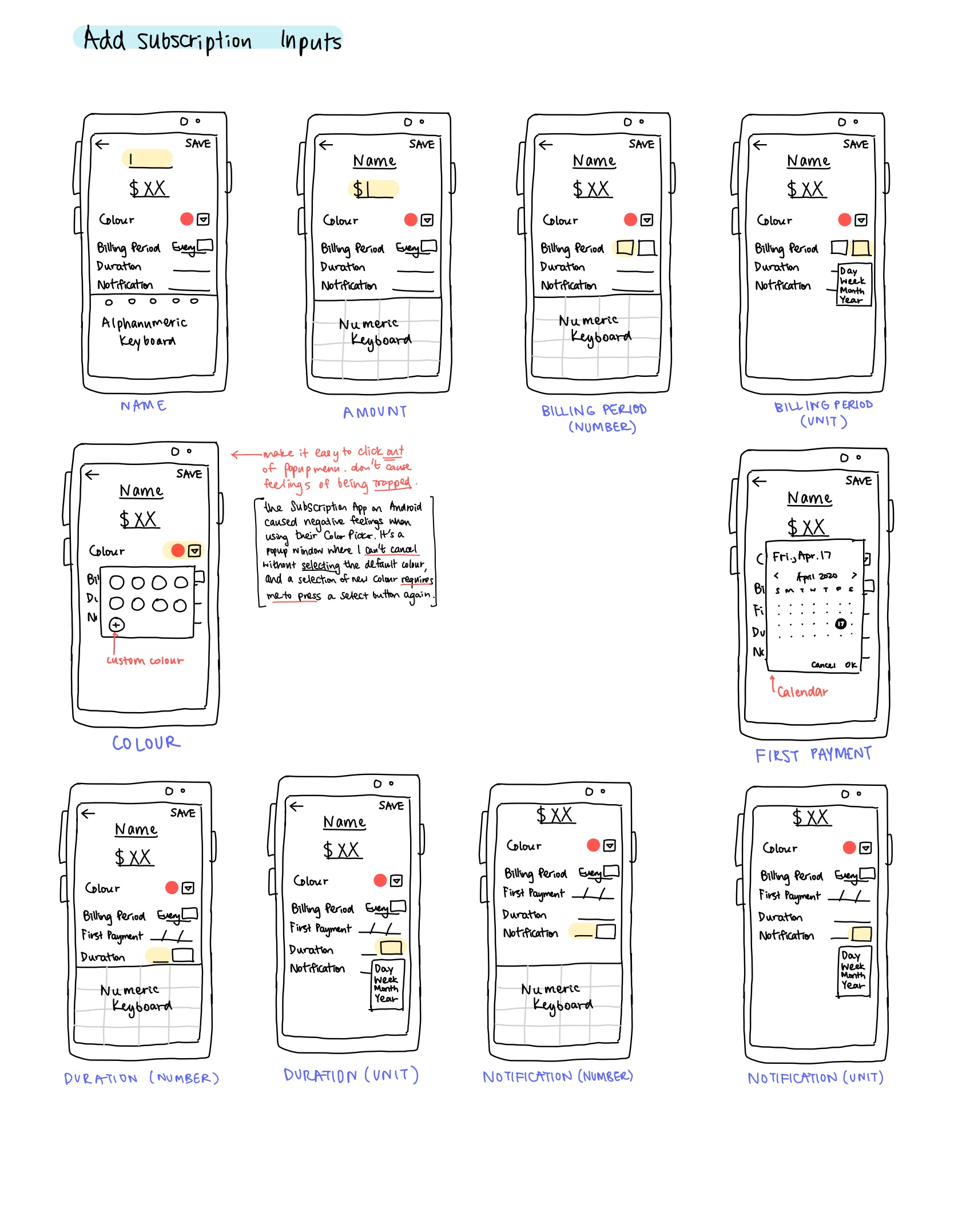
I outlined and roughly sketched out the app with an iPad. I detailed element functions and interaction flows which would help navigating through the app easier.
For example, I was certain that I wanted the color picker in the Subscription Creation page to be a popup dialog rather than a new screen, as it would be easier to see static information like the subscription name, and it would be intuitive to click away from the dialog to cancel a selection.

I had three words in mind when creating the visual space of the app:
Fresh, Clean, Space
I wanted users to feel relaxed and have an enjoyable time whenever they use the app.
.png)
I decided to use a gradient for large spaces, in order to create a sense of rich space. The other colors would be used as accent colors for labels and note markers. I also decided the majority of the screen space should be a minimal white or grey, as to not strain the eyes of the user.
Using my iPad, I sketched out different iterations of the subscription list items. It was important that the three main elements of a subscription item (Icon, Name, and Value) be easily recognizable and allow for quick reference when listed in the home screen of the app.

While designing the high fidelity version of the app, I realized that the wireframe didn't have forms that were intuitive enough for the user to navigate through.
I tried to take on the perspective of a user and really look at the edit screen and consider if I would click on the fields with the expectation that I'd be able to edit them. I was looking to check if the form provides enough visual signifiers for the user to expect the fields to be editable.

The app maintains a clean and refreshing interface for easy navigation. Field pickers are showcased in the mock-ups as well.

This was a great learning experience as I realized the value of user interviews and usability tests. I also developed my visual design skills in creating an aesthetically pleasing interface. For next steps, I would do further usability testing on the high-fidelity prototype. Features, like a Subscription Stats page, can also be added to enhance the functionality of the mobile app. In conclusion, the app is a success in bringing an intuitive and quick way to regain agency in one's finances.
